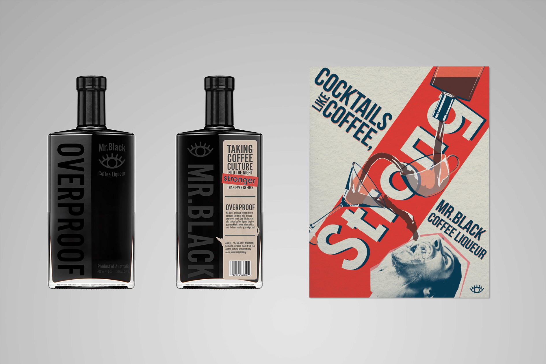
Packaging + Campaign
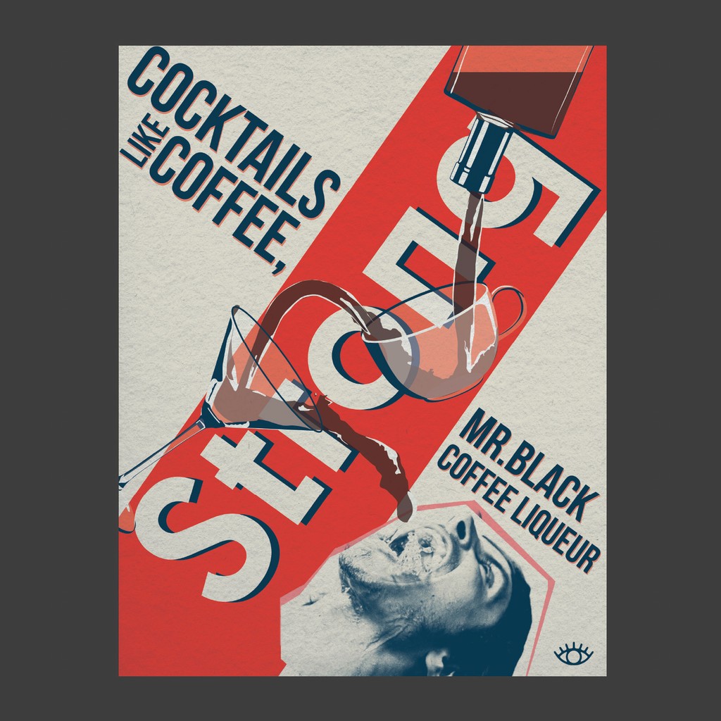
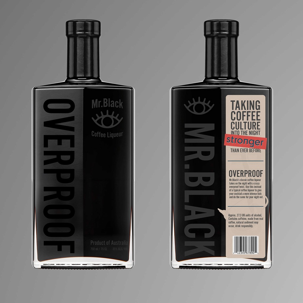
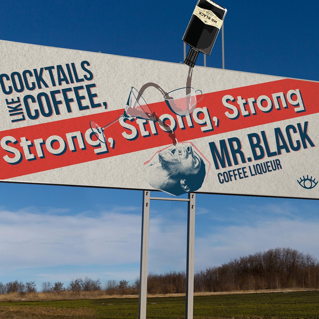
This project's goal was to create an ad campaign for my newly created Mr.Black Coffee Liqueur packaging. By the instructor, I was required to operate within a constructivist style throughout my work on this project. The different parts of the project should look like one cohesive brand.
I wanted to play into the idea that both cocktails and coffee can be "strong." By using an axial grid and strong colors I was able to achieve the constructivist style required for this project. The different parts are very cohesive and all look like they are part of the same brand.
Grey Landrum 2024
Nashville


